
Book Covers
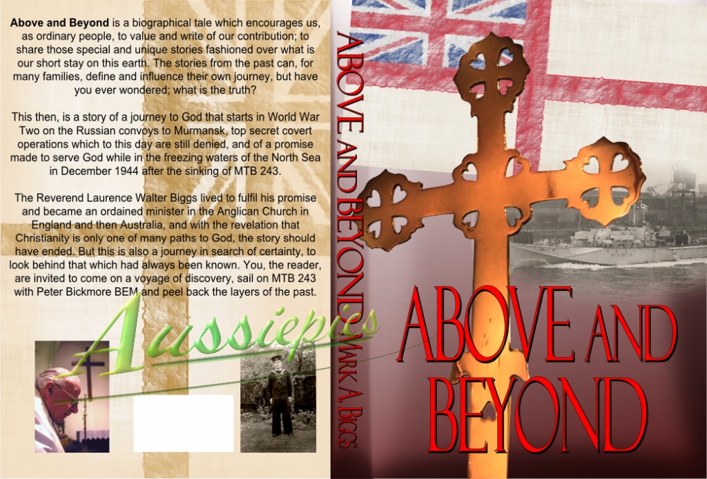
Above and Beyond - First Edition
A cover for Mark A. Biggs' book about his father's journey through the second World War and on into his ministry for the Anglican church in Australia. Build from provided photographs with added original artwork for the penant. The cross was excised from an image taken in the local church.
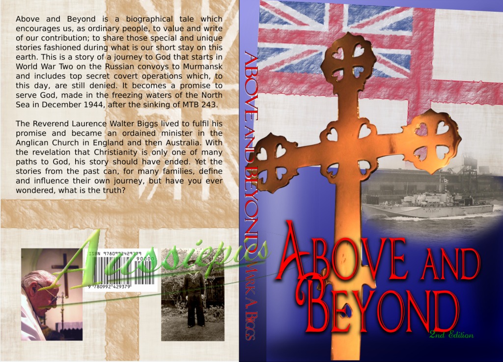
Above And Beyond - 2nd Edition
This is a same-but-updated cover for the book above. We were both so pleased with the reactions to the first one that we felt that the second printing should retain the look of the original.
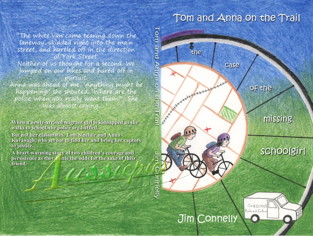
Tom and Anna on the trail
Jim's first book. Here and for the remainder of this series he commissioned the hand drawn artwork separately and provided that and the description of the titling. This was then compiled into into the press-ready production package for publication.
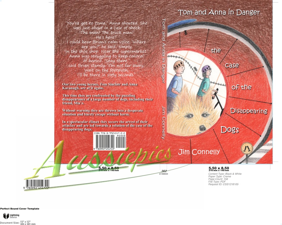
Tom and Anna in danger
Jim Connelly's second book, prepared in the same structure as previously. This image shows the file as provided to the publishing house.
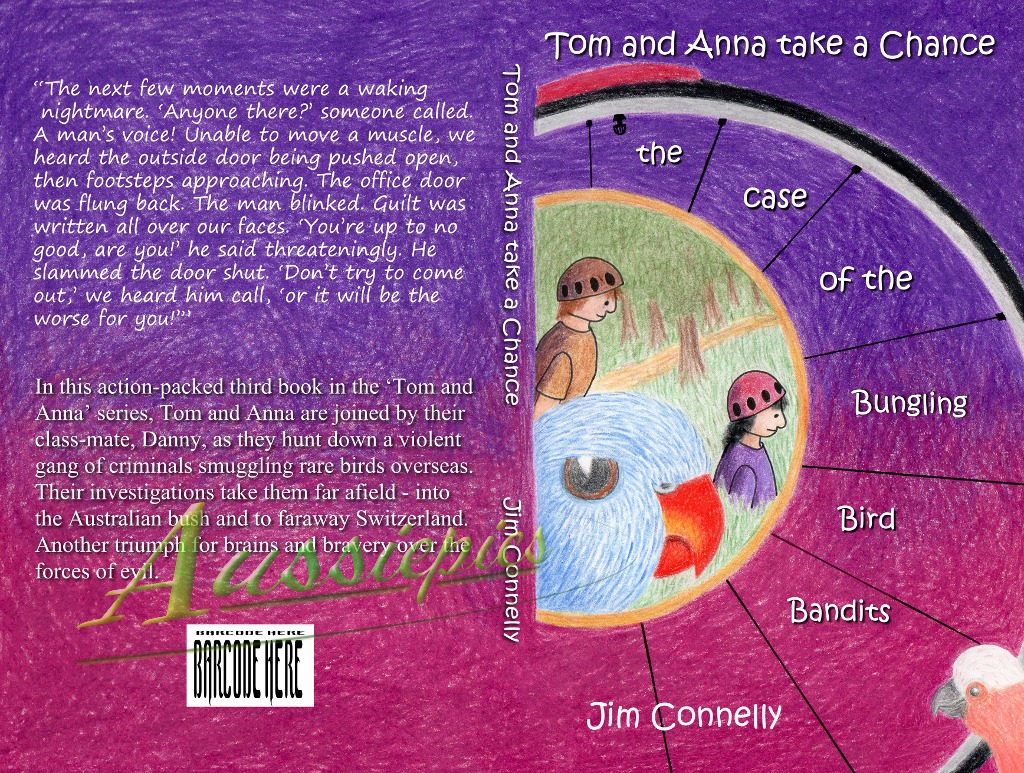
Tom and Anna take a chance
The third in Jim's series with Tom and Anna. Again using a supplied pencil drawing and overlaying appropriate text then creating the prepared file in press ready specification.

My folk
Again by Jim, this is family history. The brief was a simple cover with supplied photographs to merge into an image for the front. I was able to expand on this using some provided documentation as a feature bring the back cover into the front to create a desire to turn the book over and investigate the image and therefore the book.
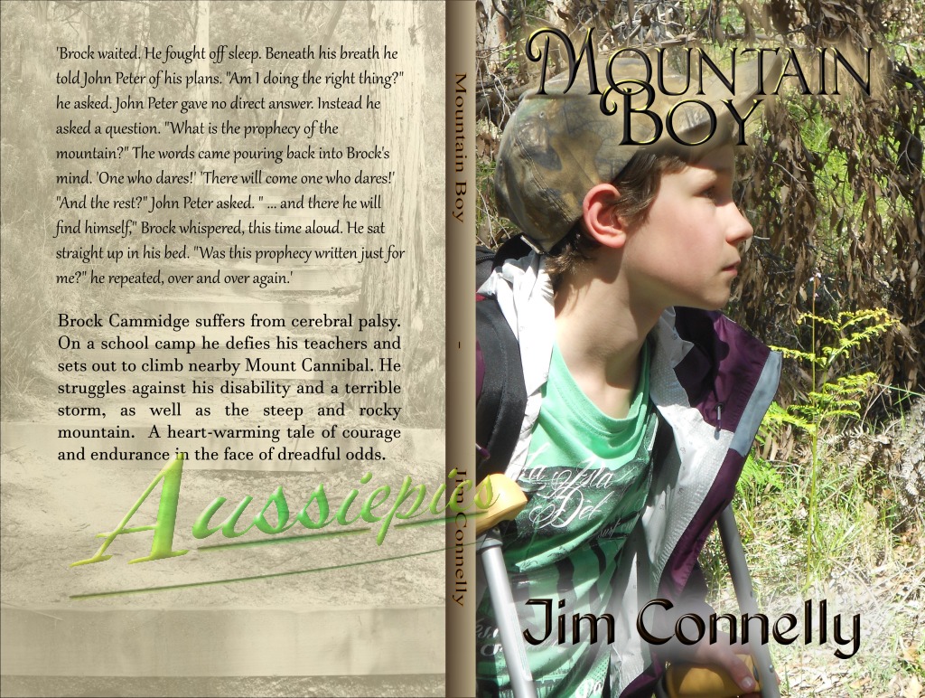
Mountain Boy
A very successful front. Jim discussed a photo front cover and promptly went off and shot a half-dozen images of which one, cropped appropriately, became the front cover. Simple titling completed the front. The rear was initially intended to be a flat grey or beige but as I had personal stock images from the actual location as used in the book the opportunity to create interest in the back cover was too good to pass up.
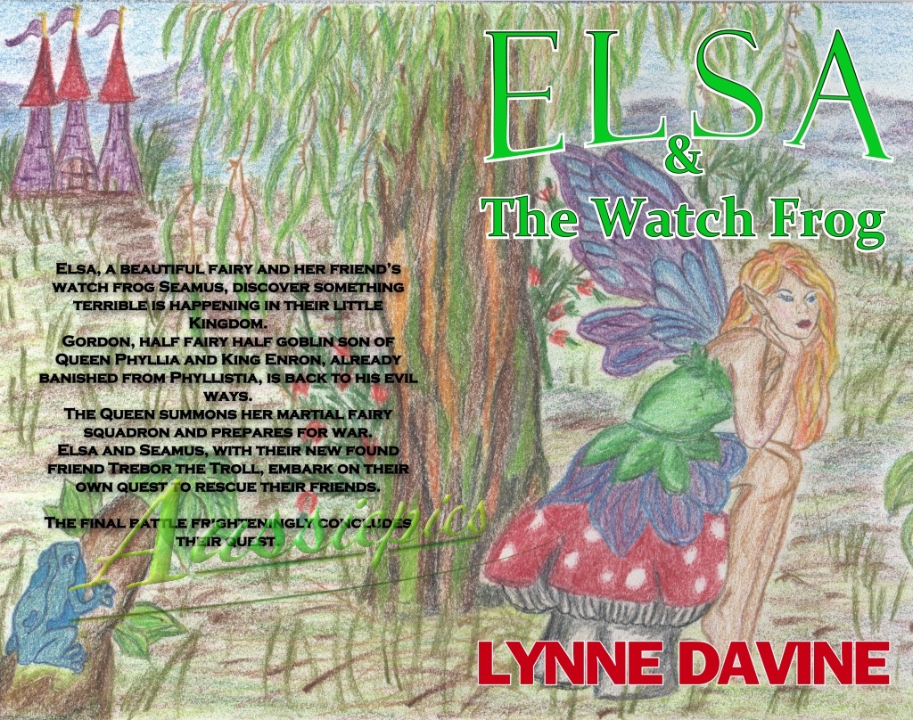
Elsa and the Watch Frog
Only the one from Lynne so far and again fairly simple graphical additions to a lovely pencil drawing sourced by the author. This would have really jumped if foil-printed titling was available but while unfortunately that wasn't an option this version looks remarkably good in print.

Project Underpants
I had plenty of time to mock this up while the book was being written so many options were thrown around and in the end this image is merely my favourite of the ones we threw away.

Operation Underpants.
After almost getting a friend arrested and thrown out of the UK as he was getting shots of the 'secret' location used in part of the storyline we couldn't not use some of the results. This cover is a result of that, and a desire to try this modern flat style of cover. It isn't as flat is could have been but this compromise seems to have worked extremely well.

the Glock image.
Probably the most ambitious single image drawn for a book cover, ... and binned (well, so far never used). I don't want to write down how many hours it took to get it to this stage but even so I'm happy with the result. Perhaps I can use it for the sequel to Operation Underpants which at time of writing this is barely started.
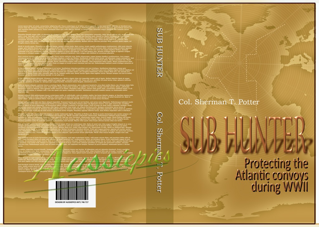
Sub Hunter - Example
Another example of a book I had plenty of time to prepare for but in this case I didn't know either the title or the author but I had been given a synopsis of the content. I provided this as a concept for the author before the book was finalised. I don't think Col. Sherman T. Potter ever got on a ship but when I needed a name with a rank this was the first and best name to come to mind.

Whittakers War
The final result based on the concept above. The colours were updated, the admiralty insignia was created from a scan, and the braid that wraps the bottom of the image is correct for the rank of the subject.


